The Stratospheric Observatory for Infrared Astronomy (SOFIA) is a one of a kind airplane: it has a 2.5 meter diameter telescope in it! We fly it around in the stratosphere at night, pointing the telescope at targets chosen competitively by the astronomical community. You can read more about why exactly we have a telescope in an airplane here.
A given SOFIA flight is composed of a number of flight legs chosen for two main reasons: to observe some particular set of targets for the instrument on the telescope at the time, and to make sure we can take off and land at places that can support us (and especially our cryogenic instruments). For various logistical reasons the latter means that 90% of the time we take off and land from our home base in Palmdale, CA, so the flights tend to be (strange) polygons.
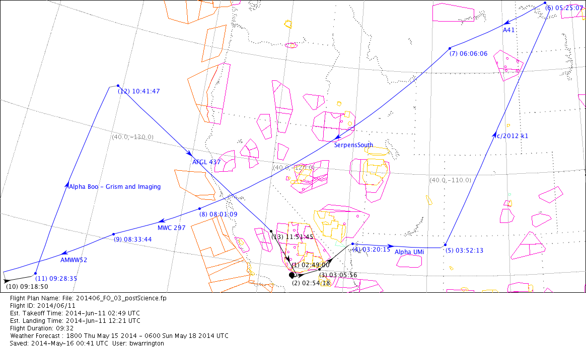
If you don’t work every day in some field related to aircraft operations, it probably looks like a bit of a cluttered mess. Special use airspaces are represented by the colored shapes (orange, magenta, and mustard), the SOFIA flight legs areas are colored vectors (blue for actual observations, black for those needed to get the plane into a particular position), plus the usual map meridians and political boundaries. This view tends to be great for flight planning purposes, but not for much else. The context that we’re all used to seeing in a map is completely missing – there’s no difference between land and ocean! So, I started to wonder if I could come up with something a little better.
SOFIA is a plane, and planes must file flight plans. When we’re in the air, anyone who’s interested can look up SOFIA’s tail number, NASA747, and see where we’re headed based off of the most recently filed flight plan for that evening. Those maps are great! They solve most of the problems with the figure above; land vs. water is clear and consistent, and everything is even presented in a nice Google Maps-esque format of click-and-drag and scroll-to-zoom style. Could it be that there wasn’t anything left for me to improve?
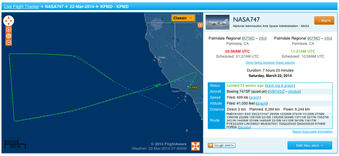
Well, that looks weird. SOFIA has a long range (about 10 hrs of flight time), and when we fly out over the Pacific, tracking of the plane’s transponder isn’t always the best and the FlightAware track can get screwy as contact is acquired/lost/extrapolated. Also, the FlightAware track can be abruptly cut off before the actual landing; my best guess is that it’s related to air traffic control hand-offs but I’m not 100% sure. To do better, I’d need a different data source. But I was sufficently invested in the idea at this point that I knew I’d figure that out somehow, since my position within the project allows me access a plethora of flight metadata. So it was time to figure out how to actually make it happen!
First step was to acquire something I could actually plot myself, so I went searching on the various flight tracking websites. Thankfully, FlightAware has both an API and an easy, direct download link of a KML file of each flight in its system. I was able to hack together enough XML knowledge to be able to parse that file, which wasn’t that bad once the basics are down. Python is my language du jour, so that actually takes care of most of the hard stuff for you by using the various libraries; the hardest part was figuring out how to navigate the namespaces properly.
import glob
import lxml
import pykml.parser as parser


def prep_tracks(loc):
    """
    Search for all .kml files in the given location, and parse them one by one
    adding the results to a list of lists that is returned to the calling func
    """

    searchpath = loc + '/*.kml'
    infiles = sorted(glob.glob(searchpath))
    xnames = {'ns': 'http://www.opengis.net/kml/2.2'}
    gnames = {'gx': 'http://www.google.com/kml/ext/2.2'}

    locations = []

    fltimes = []
    ftracks = []

    for each in infiles:
        print "Prepping %s" % each
        f = open(each)

        kml = lxml.etree.parse(f).getroot()
        f.close()

        locations.append(kml.xpath('//ns:name', namespaces=xnames)[0].text)
        times = kml.xpath('//ns:when', namespaces=xnames)
        coords = kml.xpath('//gx:coord', namespaces=gnames)

        onetrack = []
        onetime = []

        for time in times:
            onetime.append(time.text)

        for coord in coords:
            onetrack.append(coord.text)

        fltimes.append(onetime)
        ftracks.append(onetrack)

    return locations, fltimes, ftracks
This gives me the longitudes, latitudes, and times associated with each pair. I made it into a lazy function I can just point at a directory as well, for future experiments in multi-flight plotting that I still haven’t ironed out yet. Since timezones are tricky and evil, FlightAware lets you create an account and associate a timezone for everything (including downloads!), so I just changed my time to UTC to not have to worry about that.
And so it came to pass that one day I found myself stuck in an airport waiting for a delayed flight, so I got to work on the next steps. Hooray free wifi! My initial idea was to be simple; find a nice resolution image of the earth flattened out as if it were a cylinder that was unrolled, count how many rows were below the equator and use that to set the latitude scale of the image. When combined with a similar process for longitude, you’d then have a crude mapping function between pixels in your Earth image and longitude, latitude in the real world. Send the plane’s coordinates as retreived from the FliteAware KML file throught the inverse of that function, and I’d then be able to plot the plane’s location in a map of my own. Neat!
Then I realized that python has a lot of libraries. Even better, the popular python plotting library matplotlib has a lot of optional/additional toolkits, so I quickly found one to suit what I had stuck in my brain: matplotlib basemap toolkit.
Stay tuned for Part 2, where the real plotting/hacking/experimenting begins!